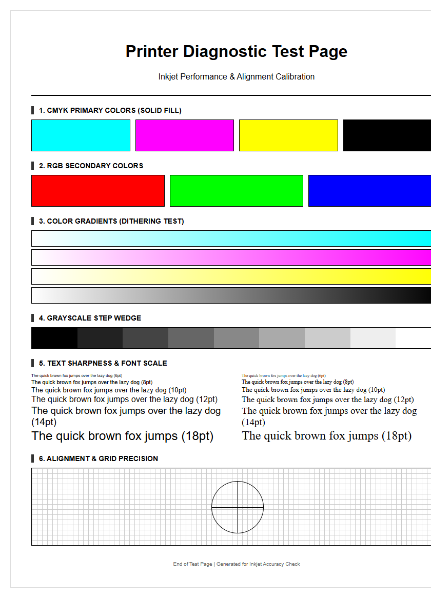
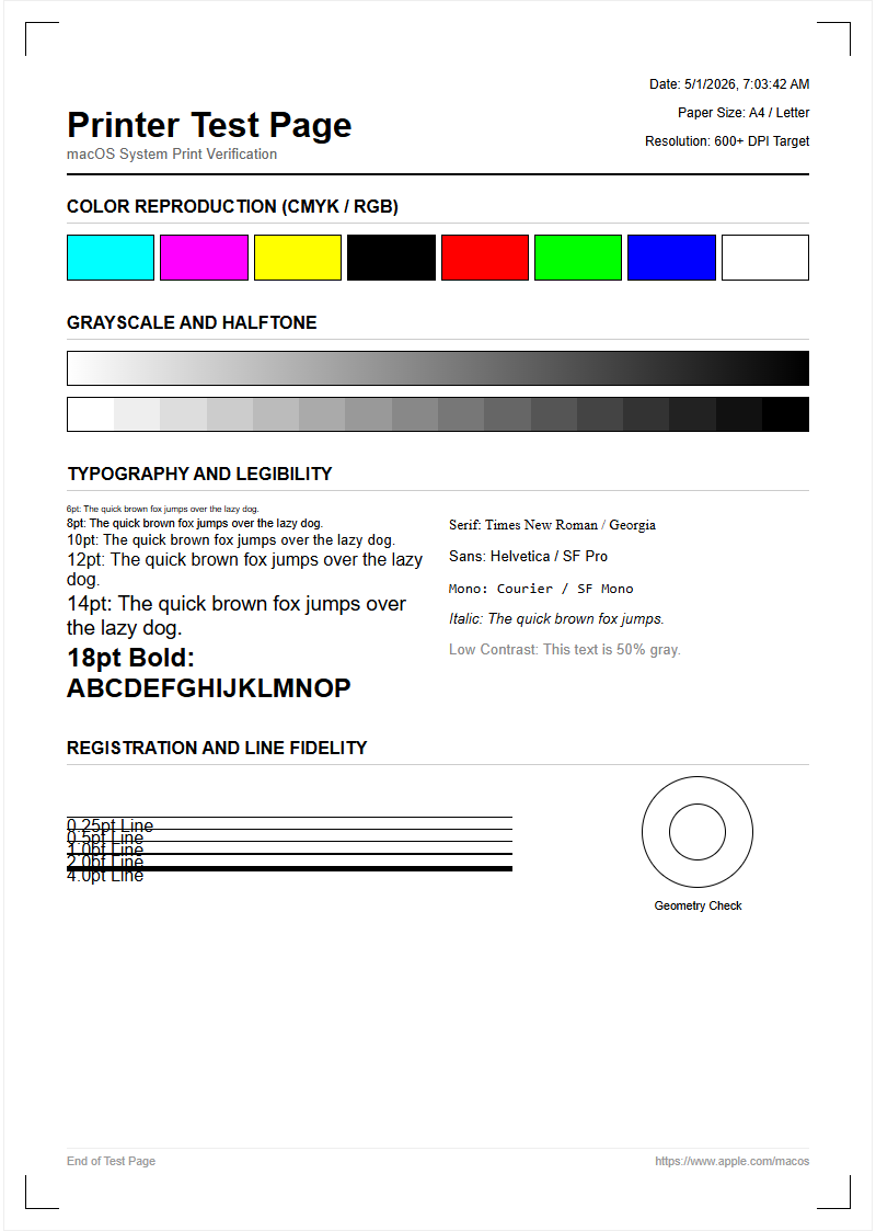
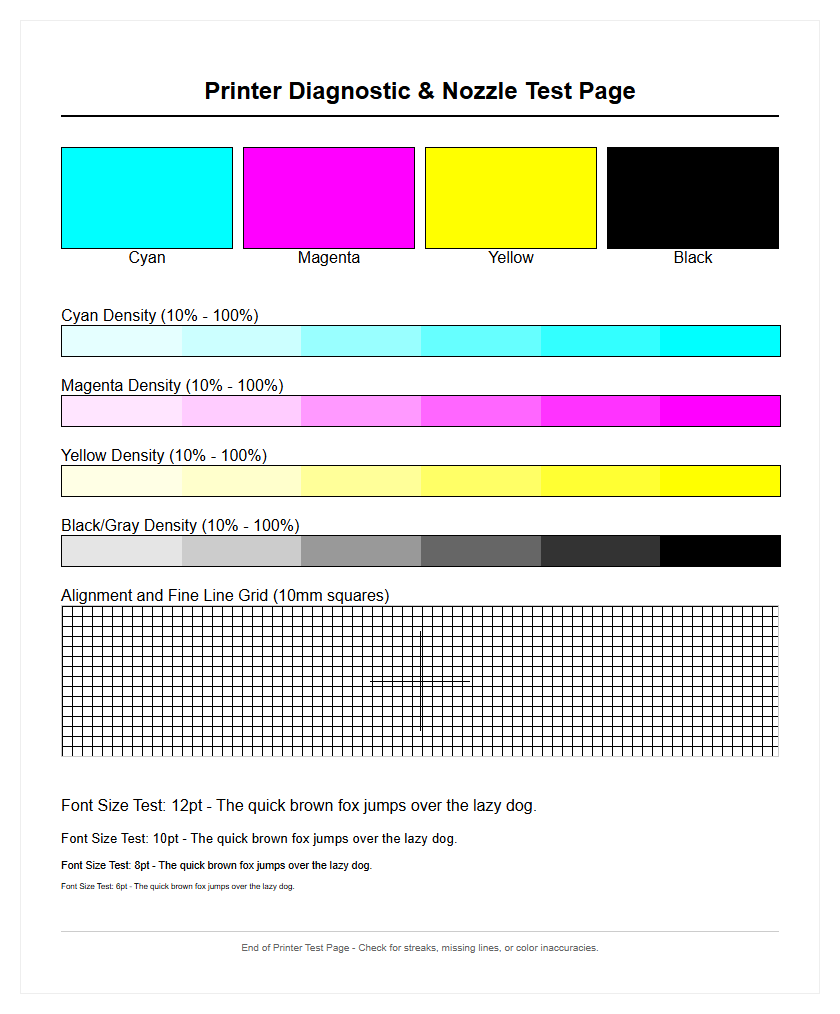
Ensuring peak output quality requires a systematic approach to maintenance, starting with a comprehensive inkjet printer test page. This diagnostic guide focuses on performing precise nozzle checks to identify clogged microscopic jets that cause unsightly banding. By executing a full CMYK calibration, users can verify color accuracy and saturation across the Cyan, Magenta, Yellow, and Black channels, ensuring professional-grade results. Additionally, routine print head alignment is vital for correcting bidirectional calibration issues and improving overall print resolution. These essential diagnostics provide a clear overview of your hardware's mechanical health, allowing you to troubleshoot performance bottlenecks and maintain optimal printer functionality with ease.
Inkjet Nozzle Check Patterns
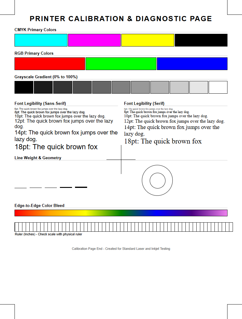
The nozzle check pattern is the fundamental diagnostic tool for any inkjet system. It consists of a series of staggered short lines or grids, each corresponding to an individual nozzle on the print head. By firing a minute droplet of ink from every piezoelectric or thermal actuator, the printer creates a visual map of the head's health. If the pattern shows gaps or broken lines, it indicates that specific nozzles are failing to fire, often due to dried ink or air bubbles trapped within the manifold. This pattern is essential for identifying which specific color channel-Cyan, Magenta, Yellow, or Black-requires maintenance before proceeding with high-resolution tasks.
- Broken Lines: Indicates a temporary blockage or air pocket.
- Missing Segments: Suggests a completely clogged or "dead" nozzle.
- Deflected Lines: Occurs when debris causes ink to fire at an incorrect angle.
- Color Contamination: Shows ink from one chamber leaking into another.
Regularly printing these patterns prevents ink sedimentation. For professional photographers and graphic designers, ensuring a perfect nozzle check is the first step in maintaining color accuracy and preventing horizontal banding across the final output.
CMYK Color Calibration Sheets
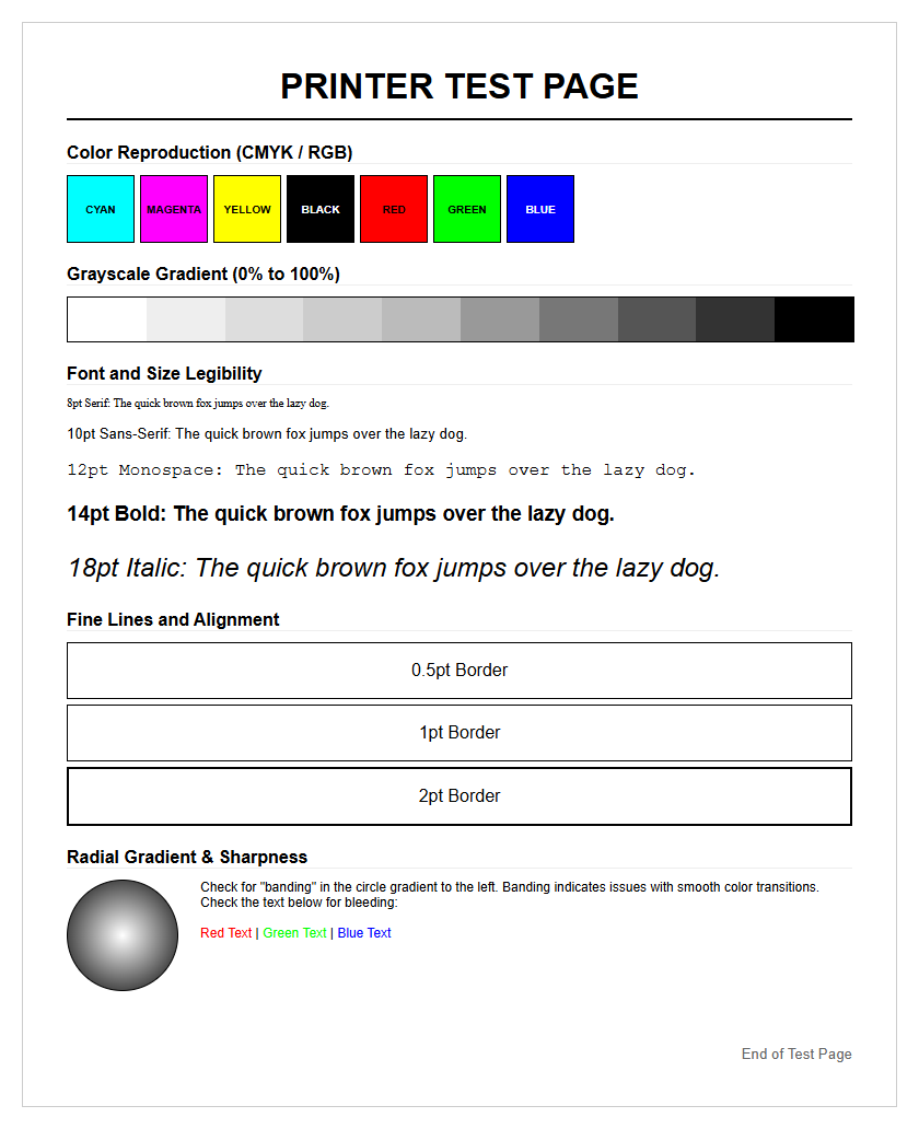
CMYK color calibration sheets are specialized targets used to ensure that the printer's subtractive color model aligns with digital design files. These sheets utilize varying densities of Cyan, Magenta, Yellow, and Key (Black) to verify how the printer interprets color data. By analyzing these sheets, users can adjust ICC profiles to compensate for the specific absorption characteristics of the substrate, whether it is high-gloss photo paper or matte cardstock. This process is vital for achieving color gamut consistency and preventing unexpected hues in the final print.
| Color Channel | Primary Function | Quality Indicator |
|---|---|---|
| Cyan | Blue-Green Balance | Hue Accuracy |
| Magenta | Red-Purple Balance | Saturation Depth |
| Yellow | Brightness/Warmth | Luminance Value |
| Black (K) | Contrast/Depth | Density (Dmax) |
Effective calibration reduces the Delta E variance, which measures the difference between a requested color and the actual printed result. Without these sheets, prints may appear muddy or overly saturated, failing to reflect the intended visual aesthetic of the digital original.
Clogged Print Head Diagnosis
Identifying a clogged print head involves a systematic review of test pages to determine the severity of ink flow restriction. In inkjet technology, microscopic nozzles can become obstructed by solidified pigment particles or dust. Diagnosis begins by identifying specific visual artifacts such as "white lines" or "banding" that appear consistently across the page. Unlike software errors, these physical blockages require mechanical or chemical intervention, such as automated cleaning cycles or manual solvent application. Understanding the difference between a "soft clog" and a "hard clog" is essential for prolonging the lifespan of the carriage assembly.
- Initiate a standard cleaning cycle to prime the ink delivery system.
- Print a secondary test page to see if the gap positions have shifted.
- Perform a "power flush" if the ink viscosity has increased due to inactivity.
- Inspect the wiper blade and capping station for accumulated waste ink.
A successful diagnosis prevents the unnecessary replacement of expensive hardware. By monitoring the droplet ejection through diagnostic patterns, users can ensure that the thermal or piezoelectric elements are functioning at peak efficiency without overheating or failing due to back-pressure.
Print Quality Evaluation Standards
Evaluating print quality requires adhering to standardized benchmarks that measure resolution, edge definition, and tonal fidelity. This evaluation is not merely subjective; it relies on technical metrics such as Dots Per Inch (DPI) and Lines Per Inch (LPI). A high-quality print must demonstrate "edge acutance," where the transition between a printed area and the substrate is sharp and free of feathering. Inkjet printers must manage ink spread, also known as "dot gain," to ensure that fine details are not lost in a sea of overlapping droplets. These standards are critical for technical drawings and fine art reproduction.
- DPI Density: Determines the fine detail and smoothness of images.
- Ink Trapping: Measures how well wet ink layers bond to each other.
- Substrate Interaction: Analyzes how the paper's coating affects ink drying.
- Moiré Patterns: Checks for interference caused by incorrect halftone screening.
By using standardized evaluation pages, technicians can objectively compare the performance of different ink formulations and hardware configurations. This ensures that the output meets industry expectations for professional-grade documentation and high-fidelity photography.
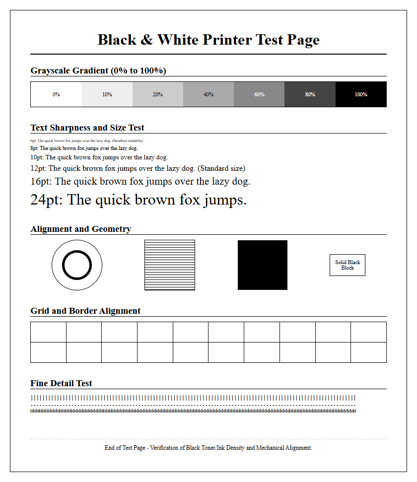
Black and White Text Sharpness
The clarity of black and white text is a primary indicator of a printer's mechanical precision and ink chemistry. Sharpness is measured by the crispness of character serifs and the lack of "satellite droplets" or "overspray" around the letters. In high-quality inkjet printing, pigment-based black inks are often preferred for text because they sit on top of the paper fibers, providing a higher optical density and better water resistance. Evaluating text sharpness involves printing various font sizes, from 2pt to 12pt, and checking for "bleeding," where the ink wicks into the paper, causing the letters to look fuzzy or bolded.
- Font Legibility: Ability to read micro-text without a magnifying glass.
- Stroke Weight: Consistency in the thickness of vertical and horizontal lines.
- Contrast Ratio: The visual difference between the black ink and white substrate.
- Character Tracking: Precise spacing between letters without overlap.
A sharp text output indicates that the print head carriage is moving smoothly and that the timing of the ink ejection is perfectly synchronized with the paper feed mechanism. This is vital for professional correspondence and legal documents.
Gradient and Grayscale Accuracy
Grayscale and gradient testing reveals a printer's ability to produce smooth tonal transitions without visible "stepping" or "contouring." In inkjet printing, this is achieved through sophisticated halftoning or dithering algorithms that arrange tiny dots to simulate varying shades of gray. A perfect gradient should move seamlessly from 0% (white) to 100% (solid black) without any sudden jumps in density. Accuracy in this area is particularly difficult because it requires the perfect mixing of CMY inks to create a "neutral gray" that does not lean toward a warm (reddish) or cool (bluish) color cast.
- Analyze 10-step or 20-step grayscale wedges for distinct separation.
- Inspect the "mid-tones" for any unwanted color tinting or metamerism.
- Check for "banding" in smooth sky or skin tone gradients.
- Verify the "Dmax," which is the deepest black the printer can produce.
Precision in grayscale is the hallmark of a well-calibrated machine. It ensures that monochrome photography maintains its depth and that shadows contain detail rather than becoming a flat, undifferentiated mass of dark ink.
Standardized Inkjet Alignment Guides
Alignment guides are used to synchronize the print head's movement with the paper's advancement. Because inkjet heads often print in two directions (bi-directional), the droplets fired while moving left must align perfectly with those fired while moving right. If the alignment is off, the result is "ghosting" or staggered vertical lines. Alignment guides typically feature a series of overlapping blocks or lines numbered for user selection. By choosing the pattern where the lines are most perfectly joined, the user recalibrates the printer's internal timing and carriage positioning to the micron level.
| Alignment Type | Visual Symptom | Correction Focus |
|---|---|---|
| Vertical | Staggered or "Z" lines | Carriage Timing |
| Horizontal | Gaps between passes | Paper Feed Roller |
| Bi-Directional | Blurred edges/Ghosting | Firing Pulse Delay |
| Head-to-Head | Color misalignment | Nozzle Plate Position |
Standardized guides allow for a repeatable calibration process. This is especially important after moving the printer or changing to a substrate with a significantly different thickness, which can alter the "throw distance" of the ink droplets.
Identifying Print Streak Issues
Print streaks, often appearing as horizontal or vertical lines across a page, are common indicators of mechanical or fluidic failure. Horizontal streaks (banding) are typically caused by clogged nozzles or an incorrect paper feed calibration. In contrast, vertical streaks often point toward a dirty "encoder strip" or debris on the print head carriage that is physically dragging through wet ink. Identifying the direction and frequency of these streaks allows a technician to pinpoint whether the issue lies in the ink delivery system, the electronic positioning sensors, or the paper transport rollers.
- White Horizontal Lines: Result from missing nozzles in the print head.
- Dark Horizontal Lines: Caused by overlapping print passes (over-inking).
- Vertical Scuffing: Often due to "pizza wheel" marks from exit rollers.
- Smearing: Occurs when the head height (platen gap) is too low.
By isolating these streaks through specific test patterns, users can determine if a simple cleaning cycle will suffice or if the internal hardware requires more intensive maintenance, such as cleaning the encoder strip with isopropyl alcohol.
Ink Saturation Level Benchmarks
Ink saturation refers to the maximum amount of ink a substrate can absorb before "bleeding" or "cockling" (warping) occurs. Benchmarking these levels is essential for creating profiles that deliver vibrant colors without compromising the integrity of the paper. This is measured through Total Ink Coverage (TIC) tests, where overlapping CMYK patches are printed at increasing percentages. If saturation is too high, the ink may pool on the surface, leading to long dry times and smudging. If it is too low, the colors will appear washed out and lack professional "pop."
| Saturation Level | Effect on Paper | Visual Result |
|---|---|---|
| Low (Under 150%) | Minimal Stress | Pale, desaturated hues |
| Optimal (200-280%) | Stable Absorption | Vibrant, accurate color |
| High (Over 300%) | Fiber Saturation | Potential bleeding/smearing |
| Excessive | Cockling/Warping | Physical damage to paper |
Benchmarks help in choosing the right media settings in the print driver. For example, photo paper can handle much higher saturation levels than standard 20lb bond paper due to its specialized receptive coating.
Color Consistency Assessment Samples
Color consistency assessments are used to ensure that a printer produces the same results over time and across different areas of the page. This is vital for "tiling" large graphics where multiple sheets must match perfectly. These assessment samples involve printing large blocks of solid color and checking for "drifting" or "shimmering." Factors such as fluctuating room temperature, humidity, and ink agitation can all affect the consistency of the output. By comparing a fresh print against a "golden master" or previous samples, users can detect subtle shifts in the ink delivery system or degradation of the print head.
- Print a full-page uniform tint (e.g., 50% Cyan) to check for "mottling."
- Compare the left and right sides of the page for density variations.
- Use a spectrophotometer to measure Delta E values across the sheet.
- Evaluate the print under different light sources to check for metamerism.
Maintaining consistency ensures brand integrity, especially when printing logos or marketing materials that require specific Pantone matches. Assessment samples provide the empirical data needed to justify re-calibration or a change in environmental controls.

Comments