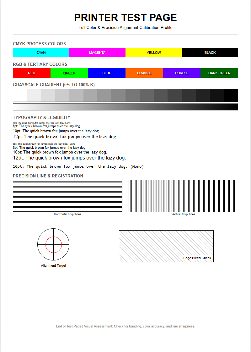
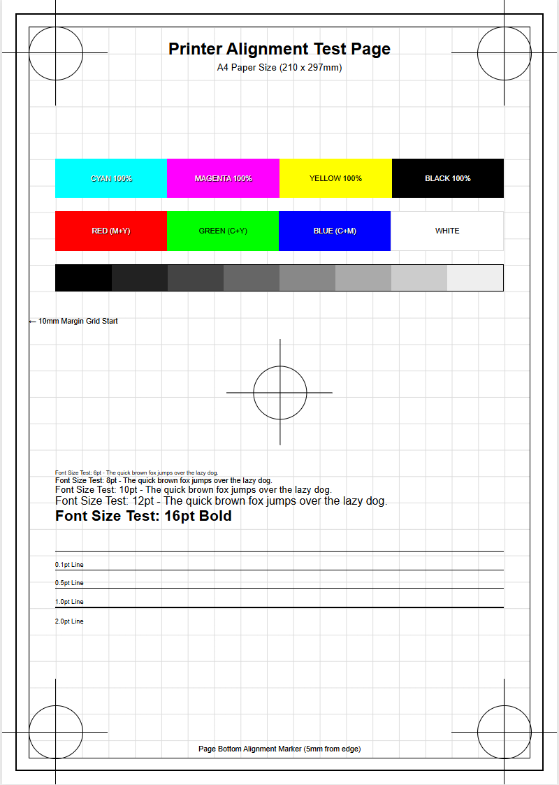
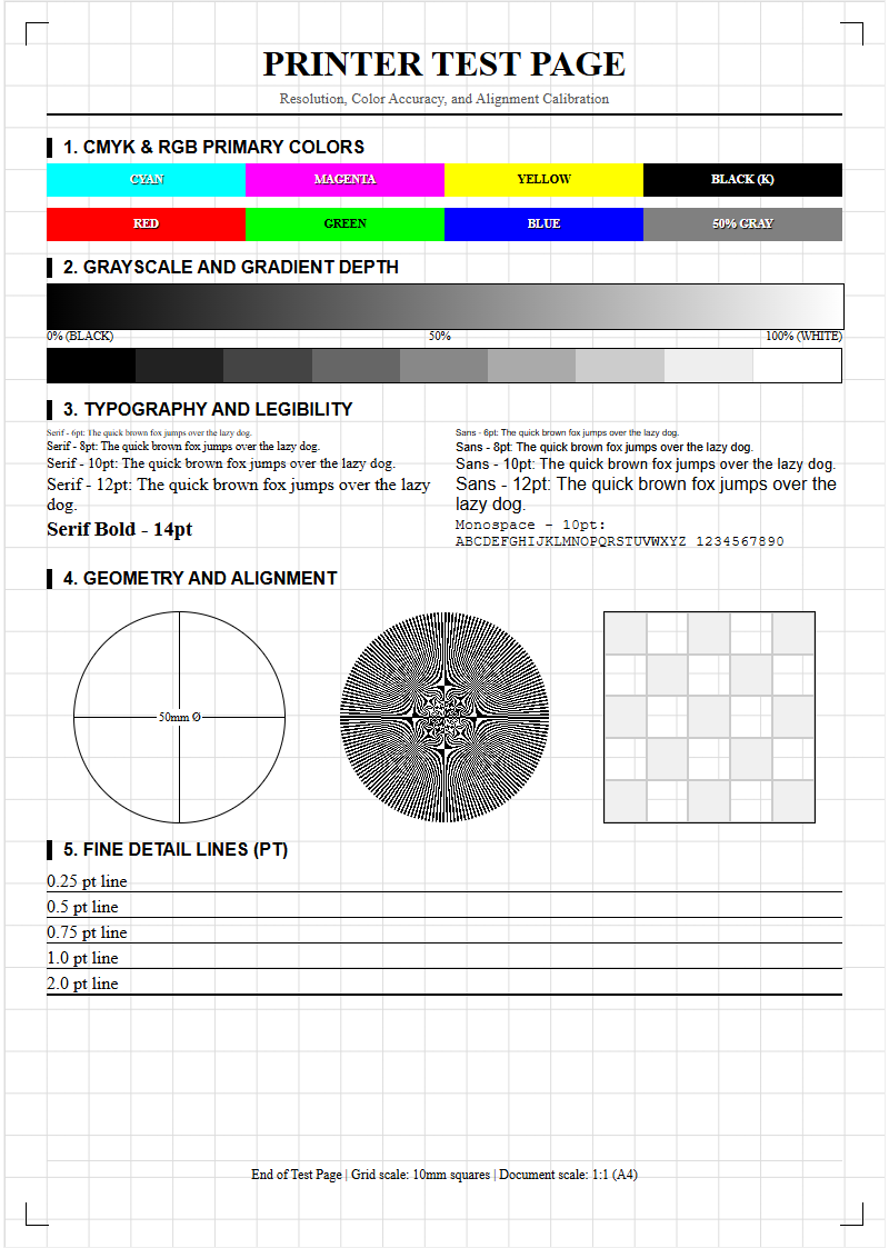
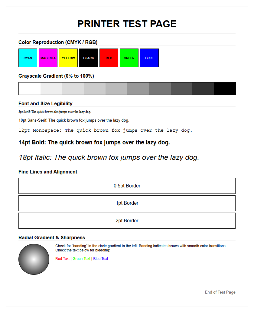
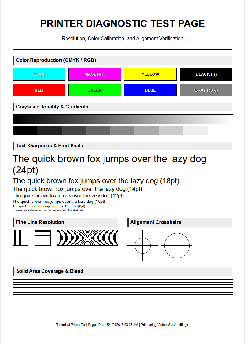
A professional Graphic Printer Test Page is essential for achieving peak output fidelity through precise hardware calibration. This diagnostic tool evaluates the full CMYK gamut, allowing users to verify color density and saturation levels across the entire spectrum. By analyzing gradient smoothness, you can identify potential banding issues and ensure seamless transitions in grayscale and multi-color ramps. Additionally, the page measures resolution accuracy by testing fine-line detail and vector sharpness to eliminate moiré patterns. Utilizing these standardized calibration targets facilitates accurate ICC profiling, ensuring consistent color reproduction and professional-grade print quality across various substrates and media types.
Graphic Calibration Essentials
Graphic calibration is the foundational process of synchronizing your software settings with the physical output capabilities of your hardware. When you initiate a graphic printer test page, you are primarily verifying that the ICC profiles-which act as a translator between digital color values and ink distribution-are correctly applied. A well-calibrated machine ensures that the saturation and brightness observed on a calibrated monitor are accurately translated onto the physical substrate. This process often involves linearizing the printer, which adjusts the ink density to ensure a steady, predictable progression from 0% to 100% coverage across all channels. Without proper calibration, images may appear muddy, lose detail in shadows, or exhibit unnatural vibrancy. Environmental factors like humidity and ambient temperature can also influence how ink interacts with paper fibers, making regular calibration cycles a necessity for maintaining professional output quality over time.
- ICC Profile Selection: Matching the software profile to the specific paper thickness and coating.
- Density Correction: Adjusting the volume of ink fired to prevent oversaturation and bleed.
- Linearization: Ensuring mathematical consistency in color increments across the spectrum.
- Substrate Settings: Verifying that the media sensors correctly identify the paper weight and finish.
Color Accuracy Verification
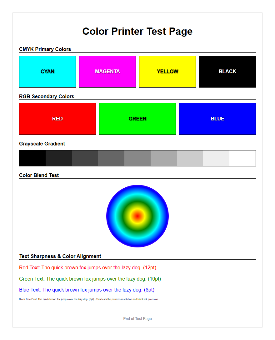
Verifying color accuracy requires a systematic approach to comparing the printed output against a known reference standard. A graphic test page typically includes a series of standardized color patches, such as those found in the IT8.7/4 target or the Pantone Matching System. These patches allow technicians to measure the "Delta E" (ÎE), which represents the mathematical difference between the intended color and the printed result. A low ÎE value indicates that the printer is operating within acceptable tolerances, while a high value suggests a shift in color gamut or hardware drifting. By using a spectrophotometer in conjunction with the test page, users can create custom profiles that compensate for specific ink and paper combinations. This ensures that brand colors remain consistent across different print runs and media types.
| Patch Type | Evaluation Focus | Ideal Outcome |
|---|---|---|
| Primary CMYK | Ink Purity | No contamination or dullness |
| Secondary RGB | Overprint Quality | Clean mixing and high saturation |
| Neutral Grays | Color Casts | Perfectly neutral, no tinting |
Evaluating Gradient Smoothness
Gradient smoothness is a critical indicator of a printer's ability to handle subtle transitions between different shades and tones. On a high-quality graphic test page, these transitions are represented by long ramps of color moving from white to 100% saturation. When evaluating these ramps, the primary goal is to look for "banding," which appears as distinct lines or steps where there should be a seamless blend. Banding can be caused by low bit-depth in the source file, poor halftone screening algorithms, or mechanical issues in the print head carriage movement. A successful test page will demonstrate a fluid transition without "posterization," where colors jump abruptly. High-resolution printers utilize advanced dither patterns to hide the individual dots, creating the illusion of continuous tone that is essential for photographic and high-end marketing materials.
- Examine the 0% to 20% highlight range for graininess or speckling.
- Check the 40% to 60% mid-tone range for sudden shifts in hue.
- Inspect the 80% to 100% shadow range for loss of detail or ink pooling.
- Look for horizontal or vertical streaks that indicate irregular head movement.
Print Head Alignment Patterns
Proper print head alignment is vital for sharpness and clarity, particularly when the printer is operating in bi-directional mode. In this mode, the print head fires ink droplets as it moves both left and right across the page. If the timing is even slightly off, the dots will not land in their intended positions, resulting in a blurred or "ghosted" image. Test pages feature specific patterns, often consisting of overlapping vertical and horizontal lines or micro-scale grids. By inspecting these patterns, a user can determine if the print head needs a micron-level adjustment. Correct alignment ensures that fine lines are crisp, text is legible even at small point sizes, and the overall image has a professional, high-definition appearance. Regular alignment checks are especially important after moving the printer or changing the ink cartridges.
- Vertical Alignment: Ensures that lines remain straight from the top to the bottom of the page.
- Horizontal Alignment: Prevents the "stair-stepping" effect on horizontal graphics.
- Bi-Directional Sync: Corrects timing issues between the left and right carriage passes.
- Media Gap Adjustment: Adjusts for the distance between the print head and the paper surface.
Resolving Image Distortion
Image distortion on a printed page often manifests as a deviation from the original aspect ratio or a slight skewing of the entire graphic. This is frequently a mechanical issue related to the paper feed mechanism or the friction rollers that move the substrate through the printer. A graphic test page includes large rectangles and perfect circles to help identify these issues; if a circle appears elliptical or a square appears as a trapezoid, the feed rate is likely inconsistent. Skewing occurs when the paper enters the rollers at an angle, leading to slanted output. To resolve these issues, technicians check the platen for debris, ensure the paper guides are snug, and verify that the drive motor is functioning correctly. Resolving distortion is essential for technical drawings, architectural layouts, and any design where precise geometric proportions are mandatory.
- Measure the diagonals of a printed square to check for squaring errors.
- Inspect the edges of the paper for "crump" marks from the feed rollers.
- Verify that the image is centered on the page according to the software margins.
- Compare physical print dimensions against the digital file using a precision ruler.
CMYK Balance Assessment
In the world of professional printing, the relationship between Cyan, Magenta, Yellow, and Black (CMYK) determines the overall tone and "feel" of a graphic. The CMYK balance assessment section of a test page focuses on the subtractive color model, where the combination of the first three colors should ideally produce a neutral gray. If the gray patches on your test page appear slightly green, pink, or blue, it indicates an imbalance in ink flow or an incorrect color profile. This "gray balance" is a fundamental pillar of the G7 calibration methodology, which aims to achieve visual consistency across different printing technologies. Accurate balance ensures that skin tones look natural and that shadow areas do not take on an unintended color cast, which is vital for high-quality commercial photography and catalog printing.
| Ink Channel | Common Issue | Correction Method |
|---|---|---|
| Cyan | Dominant blue tint | Reduce C-channel density in RIP software |
| Magenta | Reddish skin tones | Adjust magenta curve for mid-tones |
| Yellow | Dull, muddy colors | Check yellow nozzle health and ink age |
| Black (K) | Lack of contrast | Verify "Rich Black" settings (C+M+Y+K) |
Testing Resolution Quality
Resolution quality is defined by the printer's ability to render fine details and sharp edges without aliasing or blurring. This is typically measured in dots per inch (DPI), which is the physical density of ink droplets on the substrate. A specialized graphic test page will include resolution targets, such as converging lines (Ronchi rulings) and extremely small font sizes ranging from 1pt to 6pt. These targets challenge the printer's rendering engine and the physical precision of the nozzles. By examining these areas, you can determine the effective resolution of your device. It is important to distinguish between the file's PPI (pixels per inch) and the printer's DPI; a high-resolution file will still look poor if the printer's physical DPI is set too low. Testing resolution helps in optimizing the balance between print speed and image quality for various projects.
- Fine Line Rendering: The ability to print distinct lines that are only one pixel wide.
- Type Legibility: Ensuring that serifs and small counters in text remain open and clear.
- Aliasing Check: Looking for "jaggies" on diagonal lines and curved shapes.
- Point Density: Evaluating the compactness of droplets in high-detail areas.
Identifying Nozzle Clogs
Nozzle clogs are the most common hardware-related failure in inkjet printing, often resulting in "dropouts" or thin white lines across the printed image. Whether using piezoelectric or thermal inkjet technology, dried ink or air bubbles can prevent the microscopic nozzles from firing. A graphic test page includes a "nozzle check" pattern, which consists of a series of short, staggered lines for every color channel. Each line corresponds to a single nozzle on the print head. If there are gaps in the stair-step pattern, it is a clear indication that certain nozzles are blocked. Identifying these clogs early through a test page prevents wasting expensive ink and substrate on a failed full-page print. Modern printers often feature automated cleaning cycles to purge these clogs by forcing fresh ink through the head at high pressure.
- Print a standard nozzle check pattern to identify the affected color.
- Perform a "Soft Cleaning" cycle and reprint the test pattern.
- If gaps persist, initiate a "Heavy Cleaning" or "Power Flush."
- Inspect the "Capping Station" for dried ink buildup that may be causing the clogs.
Professional Printing Standards
Adhering to professional printing standards ensures that your output meets industry-recognized benchmarks for quality and consistency. Standards such as ISO 12647, SWOP (Specifications for Web Offset Publications), and GRACoL (General Requirements for Applications in Commercial Offset Lithography) provide a framework for color management. A professional graphic test page will often include control strips that allow for verification against these standards. By using these benchmarks, print shops can guarantee that a file printed in one location will look identical to the same file printed elsewhere. This is especially important for global branding and advertising campaigns where consistency is paramount. Utilizing these standards involves not just checking the printer, but also verifying the viewing conditions, such as using a D50 lighting booth to inspect the final printed output for accurate color perception.
- ISO 12647 Compliance: International standard for graphic technology processes.
- GRACoL Standards: Focused on high-quality commercial sheet-fed offset printing.
- SWOP Standards: The industry benchmark for publication and magazine printing.
- Proofing: Creating a "Contract Proof" that serves as a legal agreement of color quality.
Analyzing Visual Output
The final step in utilizing a graphic printer test page is a comprehensive visual analysis of the overall output. This goes beyond technical measurements and involves looking at the "aesthetic integrity" of the print. Observers should look for artifacts such as moiré patterns, which occur when halftone screens overlap at incorrect angles, creating a distracting wavy effect. Ghosting, where a faint duplicate of an image appears elsewhere on the page, and "ink mottling," which is an uneven absorption of ink on the substrate, are also signs of underlying issues. Using a jeweler's loupe or a magnifying glass allows for a close-up inspection of the dot structure. This holistic view ensures that all technical components-calibration, alignment, and ink flow-are working in harmony to produce a visually stunning and professional-grade graphic.
- Scan for moiré patterns in areas with overlapping textures or fine grids.
- Check for "overshoot" or "undershoot" where colors meet at sharp boundaries.
- Evaluate the "Total Area Coverage" (TAC) to ensure ink is not pooling in dark areas.
- Assess the physical surface for any scratches or "pizza wheel" marks from the exit rollers.

Comments