Achieving professional-grade print quality begins with accurately analyzing ink saturation and color density levels within specialized calibration test patterns. This process, essential for precise printer linearization, involves evaluating how specific substrates absorb pigment to determine optimal ink limits without causing bleeding or bronzing. By measuring optical density and dot gain across CMYK channels, technicians can establish a stable baseline for ICC profiling. Utilizing a spectrophotometer to capture spectral data from these targets ensures maximum color gamut and tonal range. Mastering these density metrics allows for consistent color reproduction, ensuring that your output remains vibrant, accurate, and repeatable across various media types.
Understanding Ink Saturation Levels
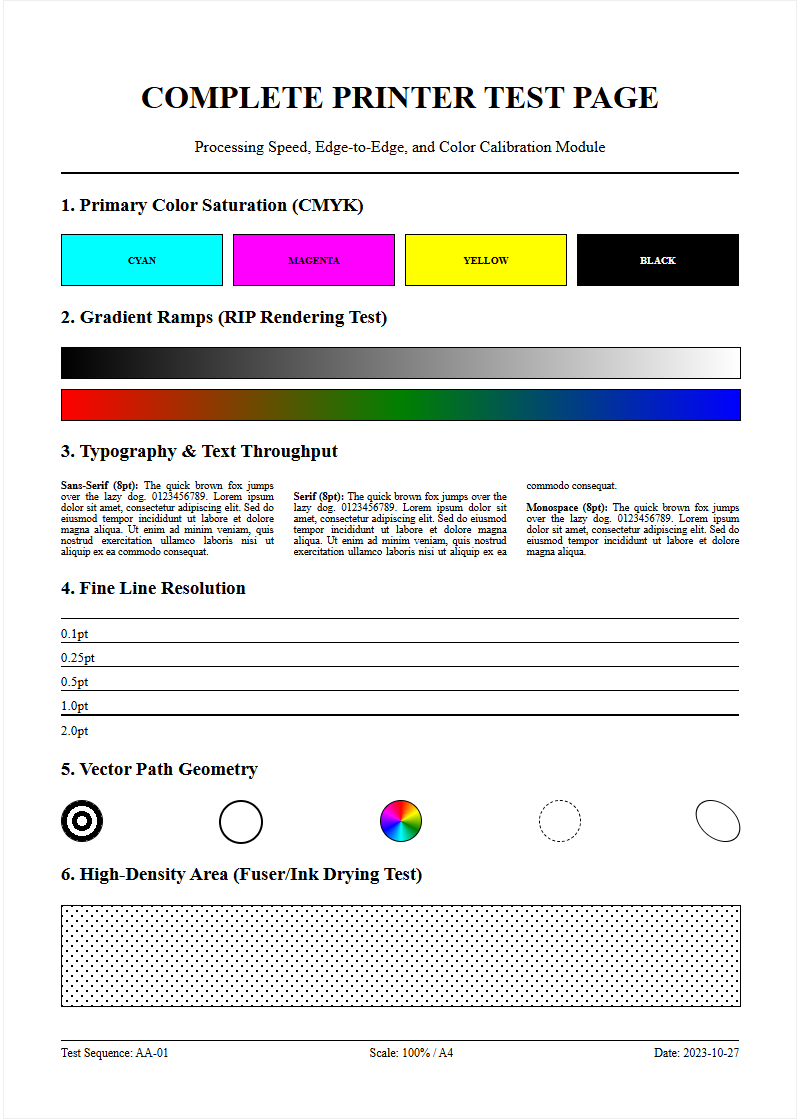
Ink saturation refers to the volume of liquid pigment or dye deposited onto a substrate to achieve specific hue intensity. In the realm of digital printing, this is often quantified through Total Area Coverage (TAC) or Total Ink Limit (TIL). When analyzing a printer test page, saturation levels determine the vibrancy and visual punch of the output. A 100% saturation in a single CMYK channel differs significantly from a composite black (C+M+Y+K), which can theoretically reach 400%. However, most hardware configurations cap this limit to prevent structural damage to the media. Understanding these levels is crucial for preventing "puddling" while ensuring colors do not appear washed out. High-quality prints require a delicate balance where the pigment load is sufficient to reach the desired color gamut without exceeding the mechanical thresholds of the printhead. By evaluating saturation blocks, technicians can identify if the delivery system is over-compensating or under-performing relative to the digital input.
Optimizing Color Density Settings
Optimizing color density involves fine-tuning the Raster Image Processor (RIP) settings to control how much ink is released per dot. This process, often called linearization, ensures that a 50% digital input results in a 50% physical output. To optimize these settings, technicians must evaluate the optical density of solid color blocks using a densitometer. By manipulating these density variables, you can avoid the "bronzing" effect, where excess pigment sits on the surface and creates an unwanted metallic sheen. Proper density settings ensure that primary colors (Cyan, Magenta, Yellow) and secondary overlaps (Red, Green, Blue) maintain their distinct visual weight without muddying the composite image.
- Adjust the ink limit settings within the printer driver software.
- Modify micro-weave or pass counts to improve ink distribution.
- Calibrate the firing frequency of the piezoelectric nozzles to ensure uniform drop size.
Paper Absorption and Ink Load
The relationship between the substrate and the ink load is a fundamental pillar of print quality. Different materials, such as gloss photo paper, matte bond, or canvas, have varying absorption rates determined by their chemical coating and fiber structure. Porous materials pull ink deeper into the fibers via capillary action, which can lead to "dot gain" and reduced sharpness. Conversely, non-porous or heavily coated media hold the ink on the surface, allowing for higher vibrance but requiring stricter ink load management. When the ink load exceeds the paper's absorption capacity, "cockling" or paper warping occurs. This physical distortion can lead to head strikes, where the printhead physically touches the wet paper, causing catastrophic print failure. Testing the interaction between load and absorption is essential for selecting the correct ICC profile for each specific media type to ensure the ink binds correctly without bleeding.
Visualizing Saturation Gradients
Saturation gradients are represented on test pages as step wedges or smooth ramps, transitioning from 0% to 100% intensity. These visual tools allow technicians to identify "banding" or "stepping," where the transition between shades is not fluid. A well-calibrated printer should display a linear progression in color weight without sudden jumps in density. Visualizing these gradients helps in diagnosing issues with the printhead's firing frequency or the screening algorithm used by the driver. If the gradient "muddies" at the 80-90% range, it indicates that the ink limit is set too high for that specific resolution. By refining these transitions, you ensure that complex images like sunsets or skin tones are rendered with photographic realism and smooth tonal depth. Common artifacts to watch for include:
- Dither patterns: Inconsistent arrangement of dots in mid-tones.
- Neutrality shifts: Grayscale gradients drifting toward green or magenta.
- Saturation plateau: The point where adding more ink no longer increases darkness.
Preventing Ink Bleed and Smudging
Ink bleed occurs when colors migrate into adjacent areas before the carrier fluid has evaporated or been absorbed. This is particularly noticeable at the boundaries where high-saturation zones meet white space or contrasting colors. Smudging is a related mechanical issue where wet ink is smeared by the printer's rollers or exit star wheels. To mitigate these issues, it is vital to monitor edge acuity-the sharpness of the line where two saturated colors meet. If the edges look fuzzy or "feathered," the saturation is likely too high for the current resolution and media combination, necessitating a reduction in ink flow or an increase in drying time. Chemical surfactants in the ink are designed to control the "wetting" of the substrate, but even the best formulations fail if the saturation exceeds the media's limit. Enabling "bidirectional alignment" and increasing inter-pass delays can help ensure that dots land precisely and have a moment to set before the next layer is applied.
Calibrating Printer Output Quality
Calibration is the process of bringing the printer back to a known standard of performance to ensure consistency. This involves running targets that check nozzle health and color accuracy across the entire spectrum. In the context of saturation, calibration ensures that the output matches the digital intent within a standardized color space like sRGB or Adobe RGB. Utilizing a spectrophotometer, a technician can measure the "Lab" values of printed patches to create a custom ICC profile. This systematic approach eliminates variables and compensates for hardware drift over time. Without regular calibration, saturation levels can fluctuate due to changes in ink viscosity or environmental factors, leading to inconsistent branding. Maintaining a calibrated workflow ensures that every print meets the required Delta E tolerance for professional-grade output. Key calibration steps include:
- Running a nozzle check to identify clogged or misfiring apertures.
- Printing linearization targets to measure primary ink densities.
- Generating profiling targets with hundreds of color patches for gamut mapping.
Testing Shadow Detail Clarity
One of the greatest challenges in high-saturation printing is maintaining clarity in the shadows. When ink levels are too high, the darkest tones "crush," meaning the distinction between 95% black and 100% black is lost. This results in a flat appearance where detail in dark fabrics or night scenes disappears. A proper test page includes shadow detail targets consisting of subtle tonal variations in the near-black spectrum. Achieving high dynamic range requires the printer to deposit enough ink for a deep black (Dmax) while keeping the dots small and controlled enough to leave microscopic gaps for highlights. If shadow detail is lacking, the solution often involves adjusting the "Black Point Compensation" or refining the ink curves in the RIP software to lighten the lower midtones without sacrificing the ultimate black depth. Visual inspection should reveal discernible separation in the dark blocks of a grayscale ramp and a lack of oily sheen in heavy black areas.
Managing High Ink Coverage
High ink coverage refers to prints where large areas are covered in dense, rich color, putting significant stress on both the hardware and the media. Managing this requires a combination of software limits and mechanical assistance. For wide-format printers, this might involve adjusting the vacuum pressure on the print bed to keep the paper flat against the platen as it becomes saturated. Failure to manage high coverage leads to "pooling," where ink droplets merge into unsightly puddles. This not only ruins the aesthetic quality but can also cause "tracking," where the wet ink transfers to the mechanical components. By monitoring the total ink density, users can produce rich, saturated prints that remain structurally sound and visually crisp.
| Feature | Action for High Coverage |
|---|---|
| Heater Temp | Increase to accelerate carrier evaporation |
| Pass Count | Increase to distribute ink load over more time |
| Ink Limit | Set to maximum 280-320% for most papers |
Drying Time and Material Compatibility
Saturation levels are intrinsically linked to drying time. The more ink deposited, the longer it takes for the carrier-be it water, solvent, or oil-to evaporate or cure. Material compatibility plays a major role; for instance, resin-coated (RC) papers dry almost instantly due to their microporous top layer, while traditional offset papers may remain tacky for hours. When testing for compatibility, it is vital to perform a "rub test" after a set interval to ensure the ink has bonded with the substrate. If the ink remains smudge-prone after the recommended drying time, it suggests a mismatch between the saturation level and the media's absorption capacity. Adjusting the "dry time per pass" in the printer settings can help, but the most effective solution is often choosing a media with a coating specifically engineered for the ink type being used. Key variables include ambient humidity, which slows evaporation, and airflow, which accelerates the removal of volatile organic compounds.
Achieving Accurate Color Depth
Achieving accurate color depth is the ultimate goal of saturation management. Depth is not just about the amount of ink, but the richness and "chroma" of the color rendered. On a test page, this is represented by the outermost edges of the color gamut. A printer with high-quality pigments and precise saturation control can produce deep, "un-muddy" colors that feel three-dimensional. True color depth is achieved when the saturation is high enough to stimulate the eyes' receptors without drowning out the texture of the substrate. This requires a sophisticated understanding of how light interacts with the ink layer. By fine-tuning the saturation levels across the entire CMYK spectrum, you can produce prints that exhibit professional-grade vibrance, accurate tonal transitions, and a wide, immersive gamut. To maximize depth without over-saturation, consider:
- Using multi-channel ink systems like Orange, Green, or Violet.
- Ensuring the lighting conditions for viewing (D50) are standardized.
- Balancing saturation with luminance to prevent dulling of the image.

Comments