Achieving professional print results starts with precise printer color calibration. This guide explores how to synchronize your hardware with specific ICC profiles to ensure consistent CMYK accuracy across various substrates. By utilizing standard test pages, you can evaluate color gamut limitations and adjust ink densities for neutral grays and vibrant tones. Understanding the relationship between digital files and physical output helps eliminate unexpected shifts in saturation or hue. Whether you are fine-tuning a wide-format plotter or a standard inkjet, mastering these color management techniques ensures that your final prints align perfectly with your on-screen vision through rigorous profiling and validation.
Mastering Printer Color Accuracy
Achieving professional-grade results requires a deep understanding of how hardware translates digital data into physical pigment. Color accuracy is defined by the printer's ability to reproduce a specific color gamut-the entire range of colors perceivable by the human eye that a device can actually print. To master this, users must utilize International Color Consortium (ICC) profiles, which act as a translator between the digital file and the specific ink-and-paper combination being used.
- Delta E: A metric used to quantify the difference between a displayed color and the printed result; lower values indicate higher accuracy.
- Rendering Intent: A setting that determines how the printer handles "out-of-gamut" colors that it cannot naturally reproduce.
- Bit Depth: Higher bit depths allow for more precise color gradations, reducing the risk of digital artifacts.
By focusing on these technical parameters during a printer test page analysis, you can identify whether the device is deviating from the intended chromatic output. Regular calibration ensures that the "True North" of your color spectrum remains consistent over time, regardless of environmental factors.
Understanding CMYK Spectrum Balance
Unlike digital monitors that use the additive RGB model, printers utilize the subtractive CMYK color model. This involves layering Cyan, Magenta, Yellow, and Key (Black) inks to absorb specific wavelengths of light. Maintaining a perfect balance between these four channels is essential for preventing unwanted color casts in neutral gray areas. When the spectrum is unbalanced, images may appear overly warm or cool, distorting the intended visual impact.
| Channel | Primary Function | Calibration Focus |
|---|---|---|
| Cyan | Controls reds and oranges | Check for cyanosis in skin tones |
| Magenta | Controls greens and yellows | Ensure vibrant purples and reds |
| Yellow | Controls blues and purples | Prevent "muddiness" in bright hues |
| Key (Black) | Adds depth and contrast | Define shadow detail and density |
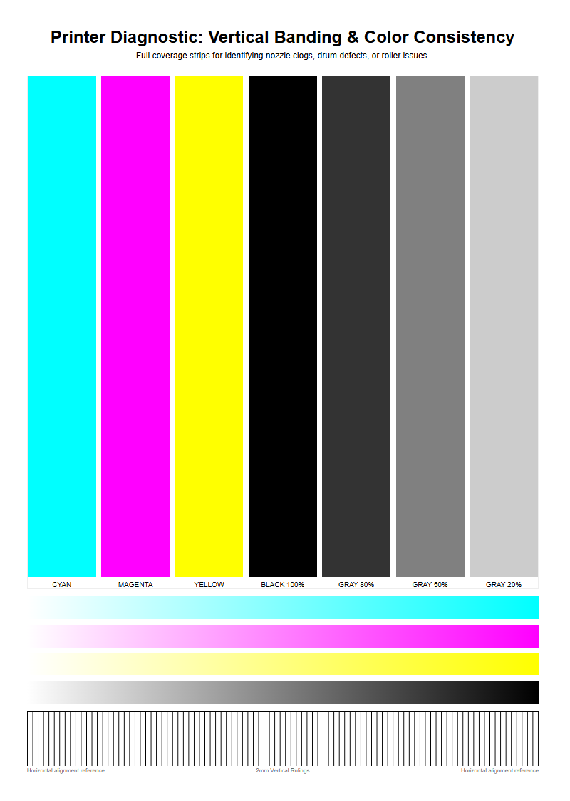
A printer test page often includes individual bars for each CMYK channel. Observing these bars allows you to see if one print head is underperforming, which would cause a systematic shift across the entire spectrum balance of your documents.
Essential Monitor and Printer Synchronization
One of the most common frustrations in digital imaging is a print that does not match the screen. This discrepancy occurs because monitors emit light while paper reflects it. Synchronization involves "Soft Proofing," a process where the computer simulates the printer's output on the screen using specific ICC profiles. Without this step, the high-luminance colors seen on a backlit LED will never translate accurately to the matte or glossy surface of a physical page.
- Calibrate the monitor using a hardware colorimeter to establish a baseline white point and gamma.
- Select the correct ICC profile in your design software that matches your specific printer and paper type.
- Enable gamut warnings to identify which digital colors are too vibrant for the CMYK ink set to reproduce.
- Perform a "Match Print" test to compare the physical output directly against the calibrated display under standardized lighting.
Proper synchronization minimizes ink waste and saves time by reducing the need for multiple trial-and-error print runs. It ensures that the color space conversion from sRGB or Adobe RGB to the printer's native language is handled with mathematical precision.
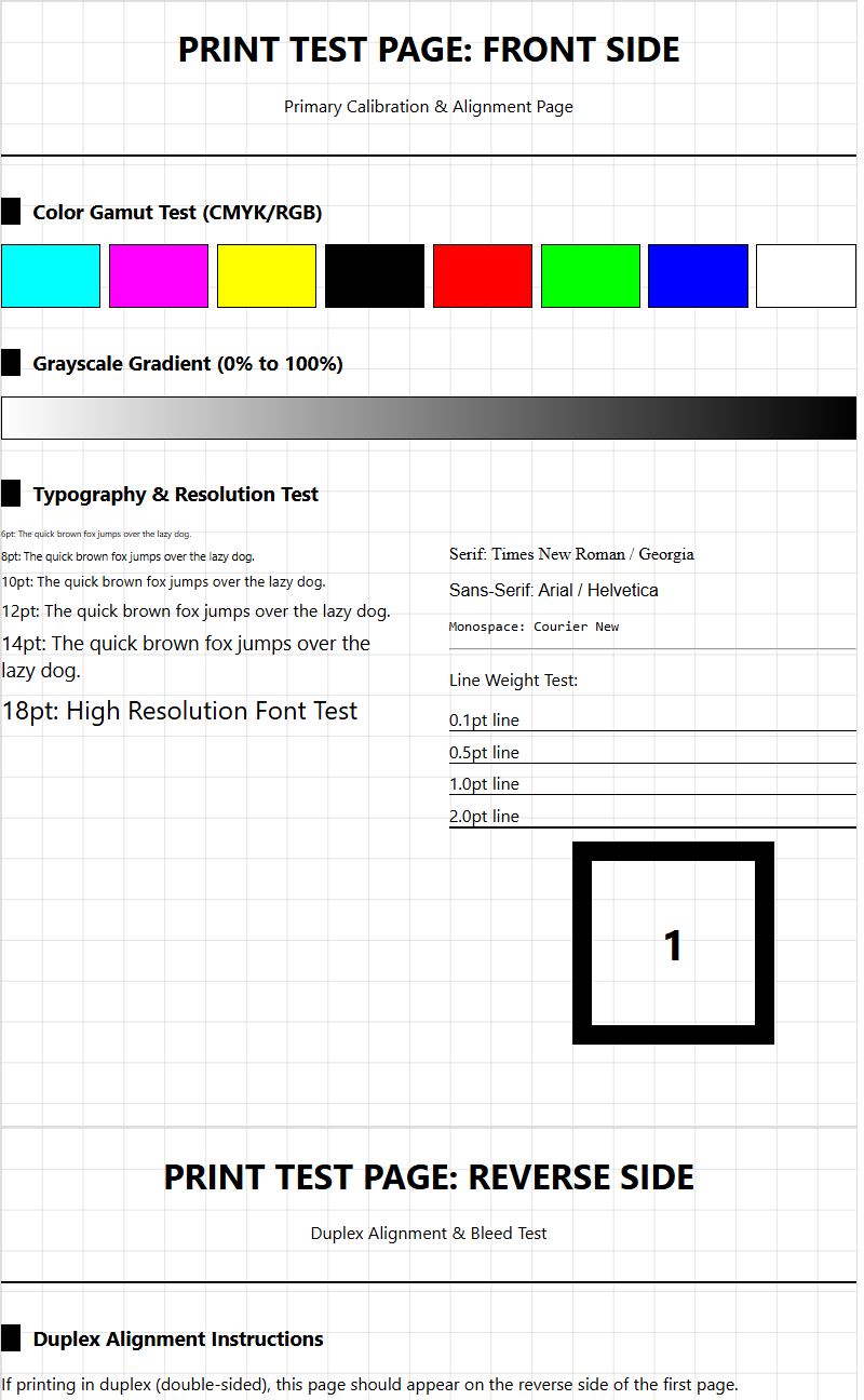
Interpreting Color Gradient Test Patterns
Gradient test patterns are essential for diagnosing a printer's ability to handle smooth transitions between hues and tones. A high-quality printer should produce a seamless "ramp" from 0% to 100% ink density without visible stepping. If you notice "banding"-distinct lines or blocks of color-it suggests a failure in the dither pattern or a mechanical issue with the print head's movement across the substrate.
- Linearity: Ensures that a 50% gray in the file actually looks like 50% gray on the paper.
- Dithering: The mathematical arrangement of tiny ink dots to simulate various shades; poor dithering leads to grainy textures.
- Transitions: The ability to move from a saturated primary color to white without a sudden "drop-off" in tone.
When analyzing a test page, look closely at the highlight areas. If the gradient disappears too early, the printer is failing to maintain detail in bright regions. Conversely, if dark areas appear as solid black blocks, the printer is "crushing" the shadows, resulting in a loss of depth and texture in the final image.
Impact of Paper Texture on Color Vibrancy
The substrate chosen for printing significantly dictates the final chromatic outcome. Paper is not a neutral medium; its brightness, whiteness, and porosity directly affect how ink sits on the surface. For instance, highly porous uncoated paper absorbs more ink, leading to "dot gain," where dots expand and make colors look darker and less saturated. In contrast, coated papers hold the ink on the surface, allowing for sharper edges and higher vibrancy.
| Paper Type | Ink Absorption | Color Saturation |
|---|---|---|
| Glossy Coated | Very Low | Extremely High |
| Matte Coated | Moderate | High / Precise |
| Uncoated Bond | High | Low / Muted |
| Fine Art Rag | Controlled | Deep / Textured |
When performing a calibration, it is vital to print the test page on the exact stock intended for the final project. Using a calibration profile for glossy paper on a matte surface will result in incorrect ink density and skewed color values, as the software will miscalculate how much ink the paper can realistically hold.
Manual Print Head Alignment Procedures
Even with perfect color data, a mechanical misalignment can ruin the output. Print head alignment ensures that the nozzles for each color are firing at the exact micro-second required to land dots in the correct position. If the Cyan and Yellow nozzles are even slightly out of sync, a green line will appear as two separate blue and yellow lines. This mechanical calibration is usually the first step in troubleshooting "blurry" or "fringed" prints.
- Enter the printer's maintenance menu and select "Align Print Head."
- Examine the printed alignment sheet, which typically consists of numbered grids or overlapping lines.
- Identify the specific pattern where the lines are most perfectly centered or where the color blocks show no white gaps.
- Input these values back into the printer interface to calibrate the horizontal and vertical nozzle offsets.
Bidirectional alignment is also crucial; it ensures that the printer remains accurate whether the head is moving left-to-right or right-to-left. Regular alignment is necessary after moving the printer or changing ink cartridges to maintain crisp, high-fidelity color reproduction.
Identifying Tint and Hue Discrepancies
A tint discrepancy occurs when a neutral color, such as a light gray, displays an unintended color lean, such as pinkish or greenish. Hue discrepancies, however, involve a shift in the identity of the color itself-for example, a sky blue appearing more purple. These issues are often caused by "metamerism," where colors look different under varying light sources, or by a specific ink channel becoming restricted due to a partial clog.
- Color Cast: A global shift where the entire image is influenced by one dominant, incorrect hue.
- Saturation Clipping: When a color is so intense that the printer cannot distinguish between different shades of it.
- Chroma Shift: A change in the purity or "vividness" of a color, often caused by poor ink quality or expired cartridges.
To identify these errors, use a "Grey Balance" test strip on your calibration page. Because the human eye is extremely sensitive to shifts in neutral tones, any imbalance in the CMYK mix will be immediately apparent in the gray blocks before it is noticeable in more colorful areas of the image.
Professional Grade Color Profiling Techniques
For those requiring absolute precision, generic manufacturer ICC profiles may not be sufficient. Professional color profiling involves creating a "Custom Profile" using a spectrophotometer. This device reads hundreds of small color patches printed on a test sheet to measure exactly how your specific printer, ink, and paper combination behaves. This data is then compiled into a unique profile that corrects for any inherent hardware weaknesses.
- Print a "target" containing several hundred color patches with all color management turned off.
- Allow the ink to "gas out" or fully dry for at least 24 hours to ensure the colors have stabilized.
- Scan each patch with a spectrophotometer to record the L*a*b* color coordinates.
- Use profiling software to generate an ICC file that maps the digital colors to these physical measurements.
This technical approach eliminates guesswork and accounts for subtle variations in ink batches or paper whiteness. It is the gold standard for photographers and graphic designers who need their output to meet strict industry standards like GRACoL or FOGRA.
Maintenance Steps for Consistent Saturation
Maintaining consistent saturation levels requires rigorous attention to the printer's fluid dynamics. Over time, ink viscosity can change, or microscopic bubbles can form in the lines, leading to "starvation" of the print head. This results in faint colors or streaks. Routine maintenance prevents these issues and ensures that the maximum ink density (Dmax) remains constant across long print runs.
- Nozzle Checks: Daily or weekly prints to ensure every single nozzle is firing correctly without obstructions.
- Cleaning Cycles: Utilizing the printer's internal pumps to flush out dried ink from the nozzle plate.
- Environmental Control: Keeping the printer in a temperature-controlled environment with 40-60% humidity to prevent ink from drying too quickly.
- Agitation: Gently shaking high-capacity ink tanks to prevent pigment sedimentation.
Saturation consistency is particularly important for branding and logos, where a specific brand color must look identical on every page. By implementing these maintenance steps, you ensure that the optical density remains stable, preventing the "faded" look that occurs when a printer is neglected.
Advanced Troubleshooting for Color Bleeding
Color bleeding occurs when wet ink from one channel migrates into an adjacent area of a different color. This often results in "fuzzy" edges or a "blooming" effect where dark colors encroach on lighter ones. This is typically a symptom of excessive ink limit settings or a mismatch between the ink type (Dye vs. Pigment) and the paper's coating. Managing the "Total Ink Limit" is the primary technical solution for this issue.
| Cause | Symptom | Technical Fix |
|---|---|---|
| Over-Saturation | Ink pooling/bleeding | Reduce Total Ink Limit in RIP |
| Slow Drying | Smearing on exit | Increase inter-pass delay |
| Capillary Action | Feathering edges | Switch to higher-quality coating |
| Static Charge | Ink "misting" | Increase room humidity |
To troubleshoot, examine a "Fine Line" test pattern. If the intersections where different colors meet appear blurred or muddy, the printer is laying down more liquid than the substrate can quickly absorb. Adjusting the "Media Type" in the driver settings often recalibrates the drying time and ink volume to eliminate these artifacts.

Comments