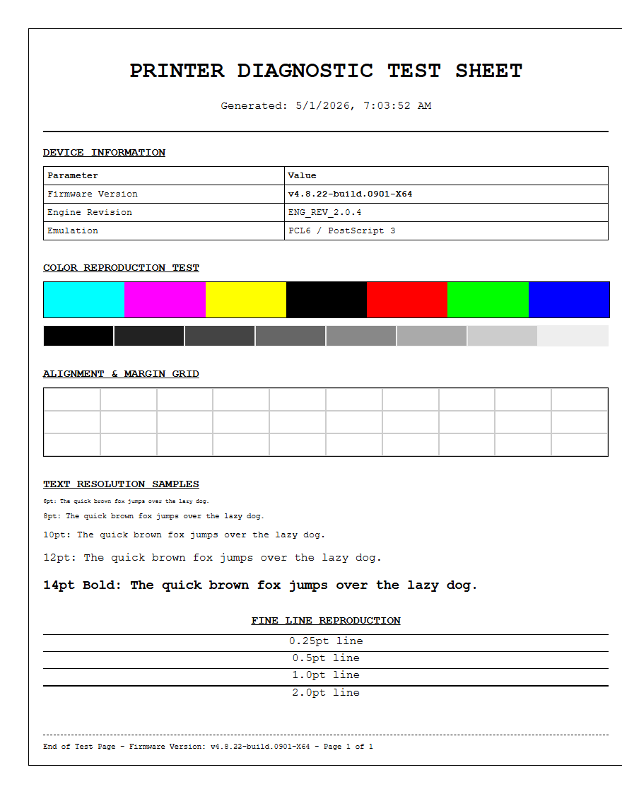
Utilizing a specialized printer test page is the most effective method to evaluate font rendering and glyph legibility across various print media. This diagnostic process focuses on how your hardware handles typeface resolution by assessing the precise rasterization of vector outlines at multiple point sizes. By closely analyzing the output, you can detect subtle issues with kerning, leading, and anti-aliasing that impact overall readability. Achieving high DPI accuracy is essential for maintaining sharp edges on both serif and sans-serif characters while preventing ink bleeding. Ultimately, these tests ensure your device maintains consistent tonal range and professional typographic clarity.
Font Legibility and Clarity Check
The primary objective of a font legibility test is to ensure that every glyph is rendered with high precision, avoiding issues like ink bleeding or toner scattering. When a printer processes a document, the raster image processor (RIP) converts vector fonts into a bitmap grid. This section of the test page evaluates how well the hardware interprets those paths. Users should look for crisp terminators and distinct apertures in letters like "e" or "a."
- Check for "ghosting" effects where light shadows appear behind characters.
- Ensure that the "counter" (the enclosed space in letters) remains open and clear.
- Verify that vertical and horizontal stems maintain a consistent thickness throughout the page.
If the printer displays "clogged" letters, it may indicate a print head alignment issue or an excess of ink flow on porous media. High-quality output requires the printer to deposit droplets or toner particles exactly within the defined boundaries of the character map, maintaining sharp contrast against the substrate background for maximum readability.
Serif versus Sans Serif Print Results
Different font families place unique demands on printing hardware. Serif fonts, characterized by small decorative strokes at the ends of character stems, require high-frequency detail to render accurately. These "feet" help the eye follow lines of text but can easily become blurred if the printer's resolution is insufficient. Conversely, sans serif fonts rely on clean, geometric lines and uniform stroke weights, making any jitter in the print carriage immediately obvious.
| Font Type | Key Characteristics | Common Testing Goal |
|---|---|---|
| Serif | Tapered ends, varying stroke widths | Detail retention and fine line precision |
| Sans Serif | Blocky, consistent weight, no feet | Edge smoothness and geometric accuracy |
When comparing these two styles, inspect the transitions where thin strokes meet thick ones. In serif fonts like Times New Roman, the "bracket" (the curve connecting the serif to the stem) should be smooth. In sans serif fonts like Arial, look for perfectly straight vertical edges without "stair-stepping" or aliasing artifacts that can occur during low-DPI rendering.
Testing Minimum Point Sizes
A crucial benchmark for any professional-grade printer is its ability to produce legible micro-printing. This test involves printing text blocks ranging from 12-point down to 2-point sizes. At the lower end of this scale, the physical limitations of the nozzle size or toner particle diameter become apparent. High-resolution machines can maintain the structural integrity of a 3-point font, whereas lower-quality units may turn the text into an unreadable smudge.
- Examine the 6pt text for general professional legibility.
- Use a magnifying glass to inspect 4pt and 2pt samples.
- Identify the "break point" where the ink begins to bridge between separate characters.
This metric is essential for printing legal disclaimers, technical diagrams, and high-density labels. Success in this category depends on the printer's native DPI (Dots Per Inch) and its ability to manage "dot gain"-the tendency of wet ink to expand upon contact with paper fibers. Achieving clear 2-point text confirms superior mechanical calibration and sophisticated driver-level dithering algorithms.
Evaluating Ink Saturation on Text
Ink saturation levels significantly impact both the aesthetics and the durability of printed text. This section of the test page focuses on the volume of pigment or dye deposited on the page. Excessive saturation leads to "wicking," where ink travels along paper fibers, causing fuzzy edges and reducing the sharpness of the font. Insufficient saturation, on the other hand, results in "banding" or washed-out characters that look gray rather than true black.
To evaluate this, observe the densest parts of thick letters. The color should be uniform without visible pinholes or white spots. If you are using an inkjet system, check the reverse side of the paper for "show-through," which indicates the saturation is too high for the paper's GSM (grams per square meter). Proper saturation balance ensures that text remains bold and authoritative without compromising the structural integrity of the paper or causing long-term smudging issues during handling.
Kerning and Character Spacing Analysis
Kerning refers to the horizontal spacing between individual characters, while tracking refers to the uniform spacing across a range of text. A printer test page must include specific "kerning pairs" such as "AV," "Wa," and "To." If the printer's hardware timing or the software's horizontal positioning is off, these characters may appear too far apart or may overlap, creating "blobs" of ink that ruin the document's professional appearance.
- Monitor for consistent white space between vertical stems in words like "minimum."
- Ensure "ligatures" (combined characters like 'fi') are intentional and not the result of mechanical error.
- Check for "inter-word" spacing consistency to ensure the print head carriage speed is stable.
Mechanical jitter or belt slippage in the printer often manifests as uneven character spacing. By analyzing the rhythm of the text on the test page, technicians can diagnose if the stepper motor is failing or if the encoder strip needs cleaning. Precise kerning is the hallmark of a well-calibrated machine capable of high-end desktop publishing.
Grayscale Text Sharpness Assessment
Printing text in grayscale is a rigorous test of a printer's dithering capabilities. Unlike solid black text, grayscale characters are created using a pattern of tiny dots with white space in between to simulate various shades of gray. This can often lead to a "screened" look where the edges of the font appear jagged or "soft." A high-quality printer uses advanced halftoning methods to maintain the illusion of a solid line even at 50% gray.
In this section, look for "moiré patterns" or visible dot grids within the letters. The goal is a smooth, continuous-tone appearance where the eye cannot easily distinguish the individual drops of ink. This is particularly important for documents containing charts, headers, or watermarks. If the grayscale text looks "noisy" or "grainy," it may be necessary to increase the print quality settings or switch to a higher-resolution halftone screen in the printer driver settings to achieve professional-grade results.
Bold and Italic Style Rendering
Formatting styles like Bold and Italic test the printer's ability to handle geometric variations. Bold text increases the "stroke weight," which puts more ink on the page and tests the printer's drying capacity and dot gain management. Italic text introduces diagonal lines and "slants," which are notoriously difficult for digital devices to render without "stair-casing" (aliasing). Because printers work on a horizontal and vertical axis, creating a smooth diagonal requires high-precision interpolation.
| Style | Stress Test Factor | Detection Point |
|---|---|---|
| Bold | Ink density and heat management | Character "filling in" or smearing |
| Italic | Angular resolution | Step-artifacts on slanted stems |
Evaluate the bold samples for "plugging" in small loops, and check the italics for straight, sharp angles. A printer that handles these styles well will produce documents that are easy to scan and read, as the stylistic differences remain distinct and clean even in dense paragraphs of technical documentation.
Small Print Resolution Benchmarks
Small print resolution benchmarks are used to determine the maximum effective resolution of the device under real-world conditions. While manufacturers often claim high DPI figures, the physical reality of the ink-to-paper interaction can tell a different story. This section uses specialized test patterns, including "reversal text" (white text on a black background), which is the ultimate test of resolution. In reversal printing, the ink must be precisely omitted to form the letters.
Observe the "knockout" areas where the white paper shows through the black ink. If the ink spreads even slightly, the fine lines of the white text will disappear. This test benchmarks the printer's ability to maintain high contrast in complex layouts. For a printer to pass this benchmark, the 4pt white text must be as legible as its black counterpart. This level of performance is mandatory for high-resolution packaging, intricate labels, and secure document printing where micro-text is used as a safety feature against unauthorized photocopying.
Black Ink Density for Professional Documents
Black ink density, often measured as "Dmax," refers to the deepest black a printer can produce. In professional documents, a high Dmax is essential for creating a "pop" effect, making the text stand out vividly against the page. If the black looks charcoal or faded, it reduces the legibility and perceived quality of the document. This section of the test page provides solid blocks of black alongside text to evaluate the consistency of the ink or toner coverage.
- Check for "bronzing," where the black ink has a metallic or reddish sheen in the light.
- Ensure there is no "mottling," which is an uneven, blotchy appearance in large black areas.
- Verify that the black ink does not rub off or smear after a standard drying period.
High-density blacks are usually achieved through a combination of pigment-based inks or high-quality polymer toners. By ensuring a deep, matte, or glossy black (depending on the media), the printer guarantees that professional reports, manuscripts, and correspondence meet industry standards for clarity and archival longevity.
Font Smoothing and Edge Definition
Font smoothing, or anti-aliasing, is the software and hardware process of softening the edges of characters to prevent them from looking pixelated. On a printer test page, edge definition is the metric used to judge how successfully the printer executes this. Every curve of an "S" or "O" should be a fluid line. If the edges appear "fuzzy," it could be a sign of "satellite drops"-tiny, stray droplets of ink that land outside the intended character area.
To analyze edge definition, look closely at the "terminals" and "serifs" of the fonts. There should be a sharp transition from the ink to the paper with no "overspray" or "fuzziness." On laser printers, this involves the precision of the laser beam and the static charge on the drum. On inkjets, it depends on the "firing frequency" of the nozzles. Perfect edge definition results in text that looks "laser-sharp," which is the gold standard for any office or production-level printing device. Check the edges under bright light to confirm the absence of any microscopic jaggedness.

Comments